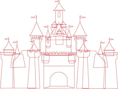
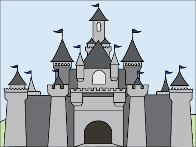
Step 1: Find a castle picture for reference. Bring into photoshop. Using the brush tool, trace the parts I like, add some other stuff from my head. Intersting part is that I am only making the left side of the castle. Save. Bring into Illustrator. Convert to vector. Resize as needed. Copy and flip so I can see the whole castle. Fairly symmetrical! Now, add another layer and trace this image, this time in Illustator. Practice using the pen tool for this. Copy shapes and squeeze or stretch as needed -- saves lots of time. Make half of a shape, copy, flip, and join. Makes things look more even. Slowly create all the shapes. I am doing all of this with a red line so I can see it over the image I am tracing.

Step 2: Instead of being empty on the inside, give all the inside a color. I used white to start. Re-order all the parts so that they stack correctly. Change the line color to a black line.
Step 3: Fix a few details, like the missing windows on the right side. Change the line weight so that it is a thicker dark line. Add color. Add another layer for the background -- just a green and blue background.

At this point, it is not done, but this version works as a color/size/detail draft. When actually projected with an overhead up onto a huge canvas dropcloth, I'd use the black and white version. When actually painted the colors here would be the underpainting, and then details -- like the lines between stones would be added.


2 comments:
I like your version of the "theater mom" stereotype! :)
Gdang. You got the mad Photoshop skilz!
Post a Comment