
Monday, December 02, 2013
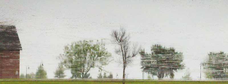
Snapshot from the Fall ACAC show
After setting up my bit of table at the Fall ACAC show, I took this picture with my phone. Not the world's greatest shot, but you can see the whole thing. for those of you who are local, the opening day of the sale is this Friday. In addition, I'll be doing a demo on Saturday morning at 10 am. I'll be showing how I pick materials, talk a little about foreground vs. background, a demonstration on spray painting with a simple stencil, etc. Should be fun.
Tuesday, November 19, 2013
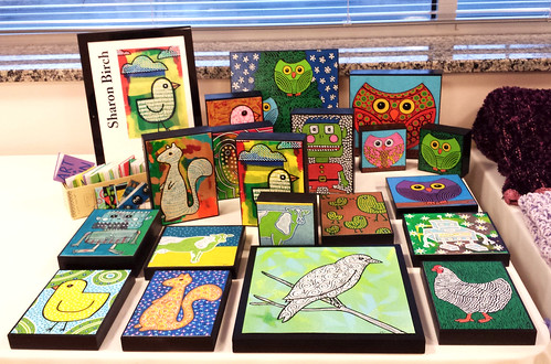
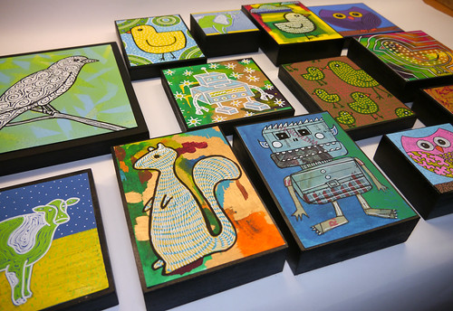
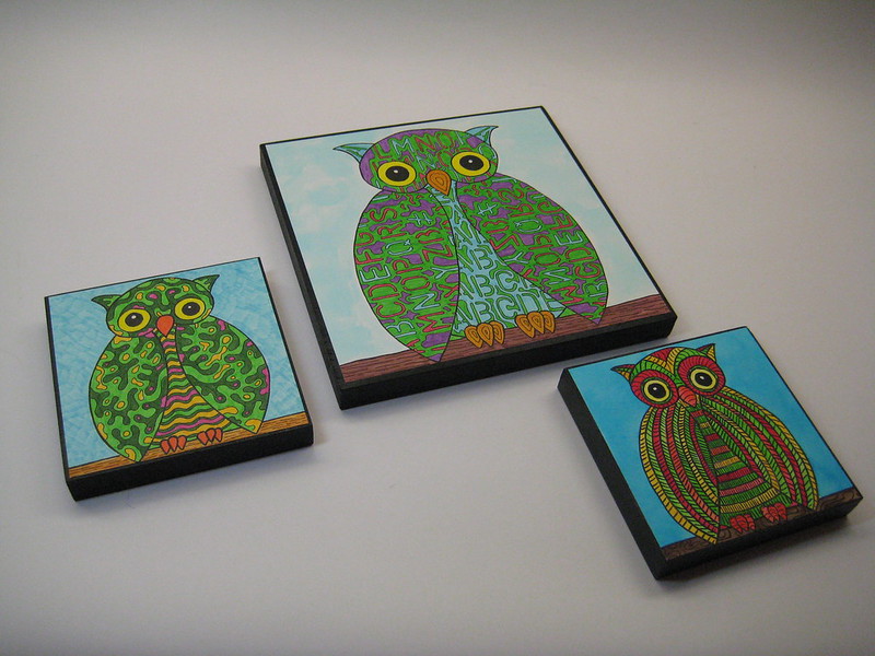
Selection of Items for the ACAC December Show and Sale
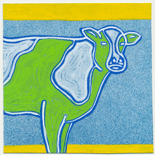
Sometimes, even if you work small, it can feel like you are working large if you make enough stuff. When I take a bunch of small pieces and arrange them all together, the result can look and feel like one big work of art. All the items I made for the December sale are small, and were made specifically for sale. They are primarily decorative, and meant to be fun. But the whole really does seem to be greater than its parts when I put them all together. I don't have the right space, lighting, or photography skills to really do this justice, but this will give you an idea of what I am talking about.
Tuesday, November 12, 2013
Wednesday, November 06, 2013
Squirrel!
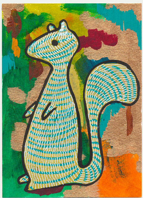
The ACAC December sale starts right around the first of December. On the morning of December 7th I'll be doing a demo on how I create these little paintings. I need to make myself a spray box so that I can use spray paint inside without covering everything with a fine mist of lime green paint. Although that actually kind of sounds like fun.
Today's critters are squirrels. The color doesn't quite show realistically here, but these squirrels are sparkly with a copper paint. It's a little more obvious in the second squirrel, where I use one kind of copper paint in the background and another on the squirrel.
Today's critters are squirrels. The color doesn't quite show realistically here, but these squirrels are sparkly with a copper paint. It's a little more obvious in the second squirrel, where I use one kind of copper paint in the background and another on the squirrel.
Monday, November 04, 2013
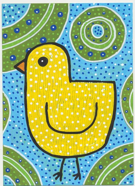
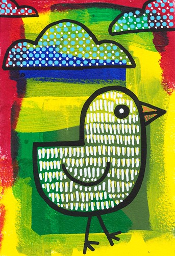
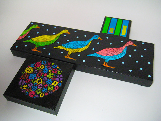
Ducks for the ACAC December Sale
I'm having a mini-booth in the Adams County Art Council's December sale again this year. I still have some leftover owls from last year, but I also have a bunch of new stuff, including these ducks. They are all 5" x 7" except for the square one which is 6" x 6".
Friday, November 01, 2013
Back in the saddle...
Time for a new post, only been six months...
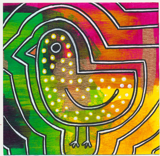
Here is an example of some things I have been making this fall. They are small, and made with acrylic, acrylic markers, and acrylic spray paint.
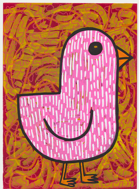
Bright Duck 5"x7"
Here is an example of some things I have been making this fall. They are small, and made with acrylic, acrylic markers, and acrylic spray paint.
Bright Duck 5"x7"
Wednesday, November 28, 2012
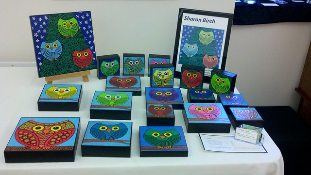
ACAC December Sale
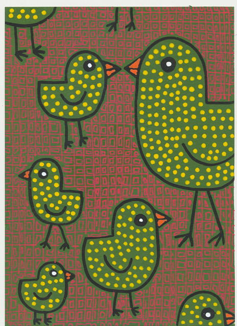
Sales were pretty good at the Adams County Arts Council show and sale in June. I sold every owl I made. So for the December sale I just embraced the idea and made it an all owl sale.
Monday, June 18, 2012
ACAC Annual Show
 I won an award this year -- the Director's Award, which is kind of an honorable mention or 5th/6th place. Pretty exciting!
Friday, May 25, 2012
ACAC June Fine Arts and Crafts sale
Today I set up my bit of table for the Adams County Arts Council June Fine Arts and Crafts sale. The organizer emailed me this afternoon and asked if I had more pieces because two have already sold -- and it doesn't even officially open up until Friday! I guess I'd better get to work...
Wednesday, May 09, 2012
Chickens and Photoshop
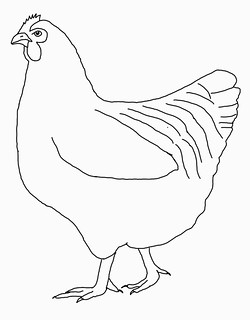
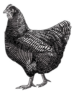
I am a very slow drawer, and not all that great at it. I'm decent enough with painting, color, composition, etc. and enjoy that part more. While old-school folks may think it's cheating, I often use various crutches to speed up the drawing part of any project so that I can move along to the other parts that I enjoy more. There's nothing new in this -- even the old masters used the technology of the day to facilitate the accuracy of their rendering. I happen to use the computer. I can start with a trace or something drawn from scratch, scan it, make it bigger (or smaller), print it out again, and trace or transfer it onto another surface. I can take an image someone else made (adhering to copyright, of course), trace it in Photoshop (hand-traced, at least, with a stylus and Wacom tablet), then totally rework it to fit my current needs. The end results are really drawn with my own hand, although I did not actually draw people or chickens or whatever from real life as they were posed in front of me. Chickens don't stand still. Plus, the big advantage of a digital version is that I can try out different style and ideas fairly quickly.
Friday, May 04, 2012
Wednesday, May 02, 2012
Photograph that looks like a painting
I took this photo around noon today, looking out across the quarry pond at Gettysburg College. It's only half the original photo, and is flipped upside down. My original reason to take the picture was to try to get a shot of some baby ducks.
Tuesday, May 01, 2012
Owls on Wood
These owls are a combination of ink and watercolor on watercolor paper, mounted on cradled birch panels. I plan on making about a dozen of these, both in the 6"x6" size and the 12"x12" size for the Adams County Art Council June Fine Arts and Crafts sale.
Saturday, April 28, 2012
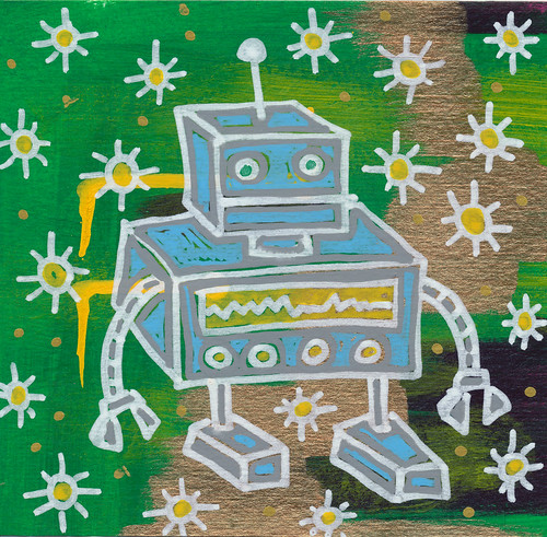
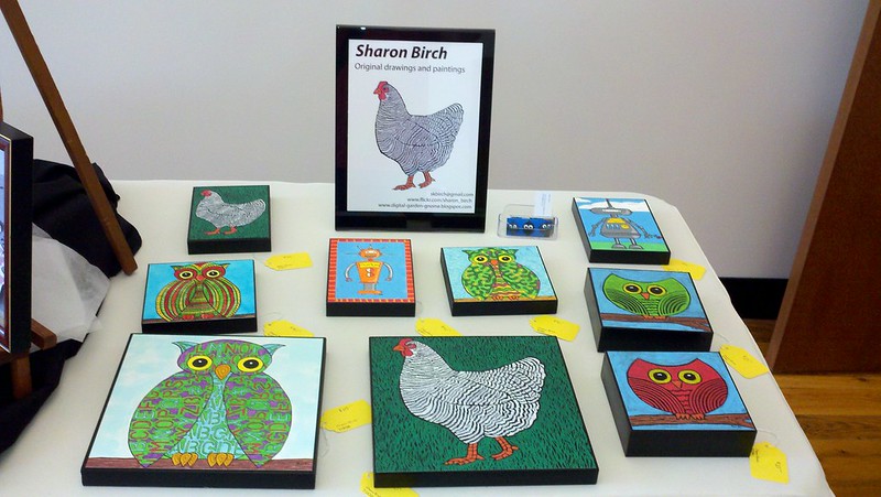
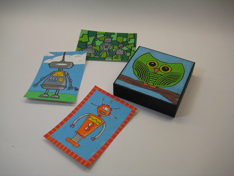
More Posca robots
Still a little obsessed with my new Posca pens. All of these are drawn on Arches watercolor paper. The owl has then been mounted on a cradled birch panel.
Wednesday, April 11, 2012
Paint drawings and my new paint pens
I discovered a new art supply last week -- Posca paint pens -- and I am now obsessed with them. As many of you know, most of my interest in making art really comes from my obsession with art supplies. I can't get new ones unless I use up at least some of what I have, so I keep making new things.
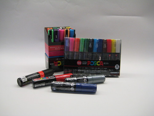
I even took a picture of them, I love them so much.
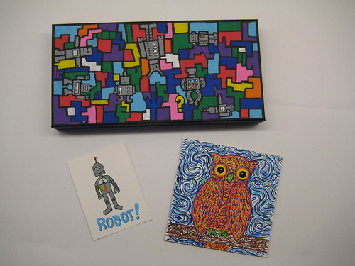
The top is a 6"x12" canvas, left is a small robot on watercolor paper, and to the right is an owl on gessoed 5"x5" mdf board. Each was incredibly quick and easy to do since it felt like drawing rather than painting.
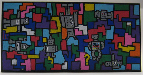
Just the robot painting.

Detail from the robot painting -- a couple inches wide. I can get really nice detail with the fine point pen, and the paint dries so fast that it's easy to add detail on top of freshly-painted layers.
Stay tuned -- the new pens re-invigorated my birdhouse project and my small wood cube project, so when I am finished with a few of those I'll post them.
I even took a picture of them, I love them so much.
The top is a 6"x12" canvas, left is a small robot on watercolor paper, and to the right is an owl on gessoed 5"x5" mdf board. Each was incredibly quick and easy to do since it felt like drawing rather than painting.
Just the robot painting.
Detail from the robot painting -- a couple inches wide. I can get really nice detail with the fine point pen, and the paint dries so fast that it's easy to add detail on top of freshly-painted layers.
Stay tuned -- the new pens re-invigorated my birdhouse project and my small wood cube project, so when I am finished with a few of those I'll post them.
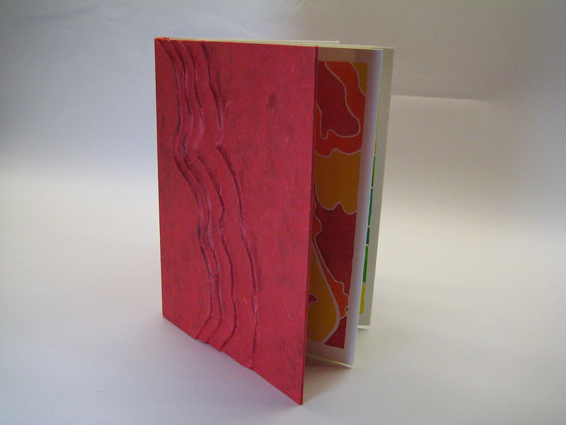
Wednesday, March 28, 2012
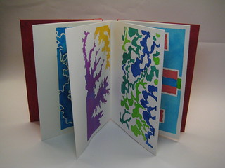
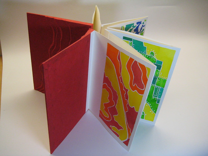
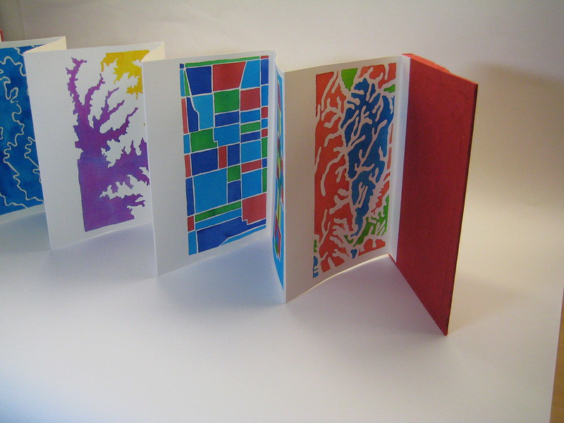
Cartobiography
This is a book made from eight watercolor paintings that are based on maps from eight locations where I have lived. The covers are sculpted from multiple layers of bookbinding board then covered in a red Thai mulberry paper and the binding is a basic accordion style. I will probably set it up to be displayed in this star arrangement, if it gets selected for the Adams County Arts Council show.
Thursday, March 01, 2012
Show is up
I finished hanging the show today. The pieces are dwarfed by the size of the room, but it's not too bad because they are bright. Pre-show jitters or post-project hindsight -- either way I am now wishing I had embraced really big art instead of of really small art! One of the pieces is pretty good-sized -- its total dimensions are about 4' square but it's a constructed canvas so it's not a square. I took a snapshot, but it doesn't really capture the color very well. You'll get the idea of composition and size, though.

All the rest of the pieces are small:
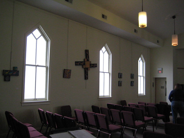
Come out and join me at the opening on Friday March 2, from 5 to 7 pm!
All the rest of the pieces are small:
Come out and join me at the opening on Friday March 2, from 5 to 7 pm!
Thursday, February 16, 2012
Preparing for Show in March
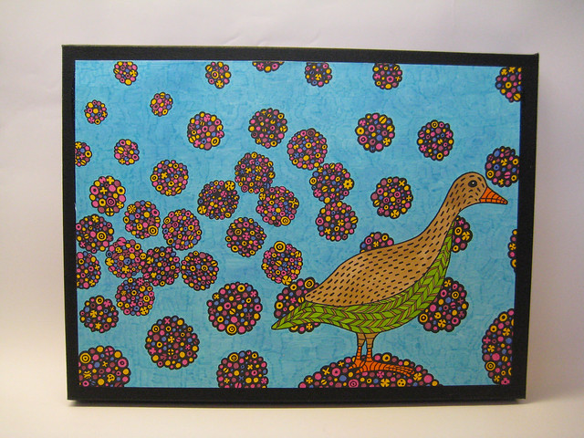
Starting on the first Friday in March, I will have a solo show at Gettysburg's Unitarian Universalist Church. I still have a fair bit of work to do to be ready, but mostly it's just mounting and assembling the final pieces and adding hanging hardware. Most of the pieces are small sets of watercolor/ink drawings/paintings that are mounted on canvas and then bracketed together. I have about 30 separate items, resulting in (probably) six combo pieces and four stand-alone paintings.
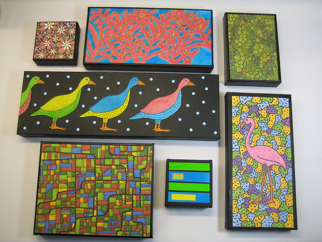
This collection should give you an idea -- a bunch of smaller paintings. I use the same birds over and over, plus more abstract items derived from maps and flowers.
This one is 12"x16" and will probably end up being stand-alone.
This one is a combination of three smaller paintings. It's not bracketed together yet so I may still change my mind and add a fourth element to it.
Stay tuned for more details about the upcoming show!
Monday, December 12, 2011
Toucan
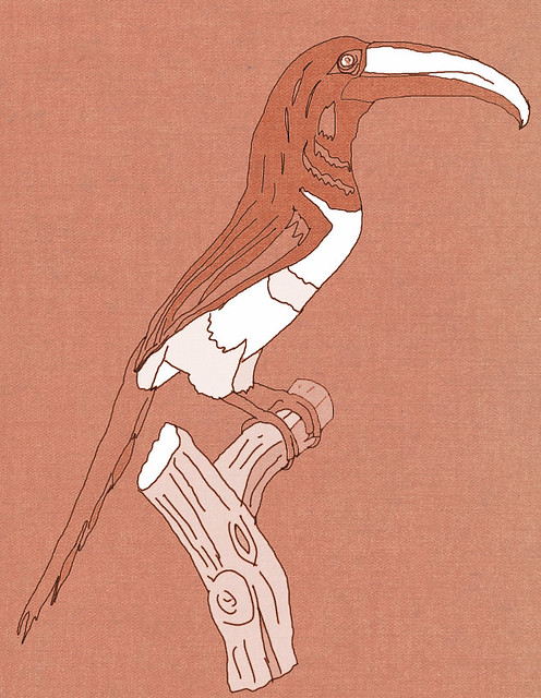
Also from 'Histoire Naturelle des Oiseaux de Paradis et des Rolliers, suivie de celle des Toucans et des Barbus' by François Levaillant and Jacques Barraband.
Bird
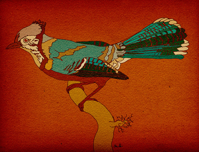
Sketch based on a bird from Biblioddyssey's recent post -- "They come from an 1806 two-volume work called 'Histoire Naturelle des Oiseaux de Paradis et des Rolliers, suivie de celle des Toucans et des Barbus' by François Levaillant and Jacques Barraband".
I did a sketch from the picture, then colored, then merged in a textured background (and messed with overall color). The hot new color for 2012, according to Pantone, is a bright organgey color.
Thursday, October 27, 2011
A New Blog
Apparently it has been six months since I posted here. I have been working quite a bit, but more on process than on completed stuff.
And I started a new blog a week ago. I know, crazy. It is purely about process -- about trying to learn to be a better artist and illustrator. I am blogging it mainly to try to get into the habit of regular posting (and making stuff to post on more regular basis also!).
http://schoolofdoodle.blogspot.com/
Wednesday, April 27, 2011
Leather Sketchbook
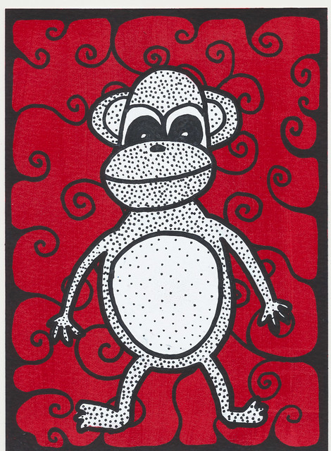
I haven't been doing much of anything lately -- work is taking up about half my evenings and the other half I just want to watch tv (although I have been working on the monkey rug while I watch tv -- stay tuned because one day I might finish it and post a picture!). I made this sketchbook about three weeks ago.
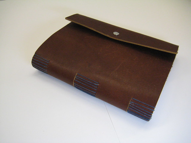

Super simple construction -- it took longer to cut and fold and punch the signatures than it did to make the cover and bind it since the cover is just a trimmed piece of thick leather. The binding is a longstitch. It's a little uneven because the leather was so stiff and I was sewing through a slit rather than having open slots like in the small leather book I posted about earlier. The cover flap uses a screw post thing (it looks like a two headed screw) like a button. The button hole is still a little stiff so I mostly just unscrew the screwpost, open or close it, and then screw it back on.
Super simple construction -- it took longer to cut and fold and punch the signatures than it did to make the cover and bind it since the cover is just a trimmed piece of thick leather. The binding is a longstitch. It's a little uneven because the leather was so stiff and I was sewing through a slit rather than having open slots like in the small leather book I posted about earlier. The cover flap uses a screw post thing (it looks like a two headed screw) like a button. The button hole is still a little stiff so I mostly just unscrew the screwpost, open or close it, and then screw it back on.
Friday, April 01, 2011
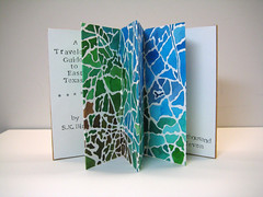
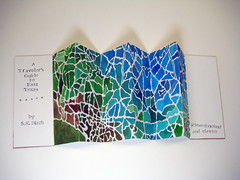
Traveler's Guide to East Texas
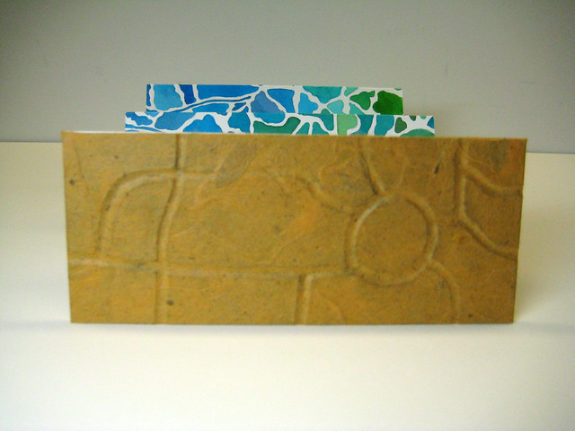
This is an accordion-bound small book. The pages are an abstraction of a map, painted in water color on Fabriano Bright 180lb paper. The text is stamped with black ink, and is intentionally a bit off-kilter. The covers are book board and yellow Thai Mulberry paper. This is the piece that I am submitting to the Adams County Art Council annual juried show.
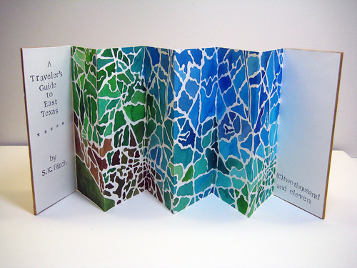
It's a little different from what the ACAC show usually has, and it's actually getting pretty competitive so I am not sure what my chances are. I had originally planned on making a watercolor painting but while I worked on it all I could think of was what a cool book I could make from the image. I already had the boards cut and all the supplies I would need to make it into a book, and I had an idea for the covers, so at the last minute, after the painting was completed, I decided to do the book instead. It was hard to cut the painting -- one mistake and all the work was for nothing, and it's just weird to take a completed painting and chop it in half. But once I did it I knew I had made the right choice because I am happier with the book than I was with the painting.
The cool thing about accordion binding is that you can view the pages as if they are pages, or spread the whole thing out as if it were a single image.
The cover on this book is similar to the one on the blue chicken book -- I carved a design into the bookboard, then covered with a Thai mulberry paper.
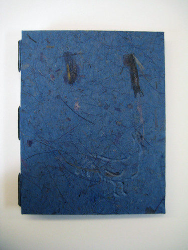
Sunday, March 20, 2011
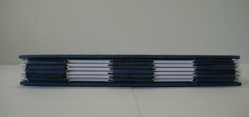
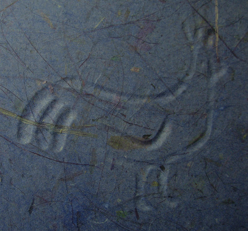
Blue Sketchbook
This is my first multiple signature book that I have made at home rather than in class. I made a few mistakes, but it's a good start. The decorative paper is a very rich, bright blue and the inside signatures are a nice heavy drawing paper. The chicken image was cut into the board cover before I covered it in the paper.
This one was bound using the longstitch method. I cut strips of flexible backing and covered them with the same blue decorative paper as the covers, then glue them to the inside of the cover. Then I added a nice green endpaper to the inside of the covers. If the book were any bigger this wouldn't work because these strips wouldn't be tough enough to support the weight of the signatures inside. I should have made the top strips align with the signatures because I think they might tear, but live and learn!
I did a kind of fake debossing method -- I cut the chicken design then peeled out layers of the bookboard until it was deep enough. After gluing down the paper, I burnished in the design a bit more. I'll use this method again but next time with a thicker paper (can press in harder) and a less busy design on the paper.
Saturday, March 12, 2011
Little Books, Round Two!
I took the next bookbinding class at Pyramid Atlantic. I can't say enough how much I enjoyed the classes, the studio, and the opportunity to just go do something for a change!
I made three books during the two classes:
The first used something called the longstitch binding, which sews the signatures together while wrapping the thread around strips of the cover. It has a soft leather cover (not leather covering board) and is about 2.5 by 4 inches.
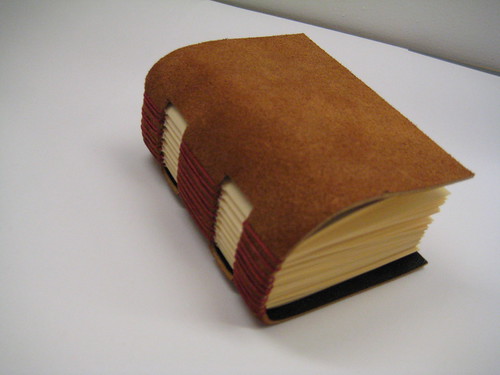
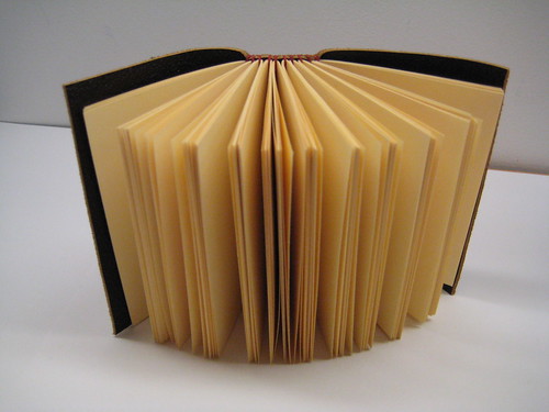
The second uses a similar method to bind the signatures to the cover, but in this case the stitching goes over some leather hinges that I sewed onto a hard cover (decorative paper over board). It's about 3.5 by 5 inches in size.
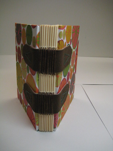
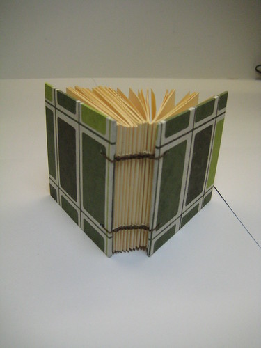
The third one was actually the hardest to make. I was careful when covering the boards to get the paper to align well. This one uses the Coptic stitch method to bind the signatures together and to the cover. It uses two needles at once, and it kind of braids along the spine (poke up through a signature, then go back two signatures and poke through but to one side, then poke up the other needle, and back two and along the other side and so forth). It is very sturdy, allows the book to lay flat when open, and looks nice. My little row of braid is very wobbly and my signatures were uneven, but this was may favorite.
I made three books during the two classes:
The first used something called the longstitch binding, which sews the signatures together while wrapping the thread around strips of the cover. It has a soft leather cover (not leather covering board) and is about 2.5 by 4 inches.
The second uses a similar method to bind the signatures to the cover, but in this case the stitching goes over some leather hinges that I sewed onto a hard cover (decorative paper over board). It's about 3.5 by 5 inches in size.
The third one was actually the hardest to make. I was careful when covering the boards to get the paper to align well. This one uses the Coptic stitch method to bind the signatures together and to the cover. It uses two needles at once, and it kind of braids along the spine (poke up through a signature, then go back two signatures and poke through but to one side, then poke up the other needle, and back two and along the other side and so forth). It is very sturdy, allows the book to lay flat when open, and looks nice. My little row of braid is very wobbly and my signatures were uneven, but this was may favorite.
Subscribe to:
Posts (Atom)